I solve problems for people by turning complex systems into simple, delightful experiences.
Spring Health App
Problem
Spring Health needed to integrate a library of CBT and mindfulness exercises into its mobile app under tight constraints: text-heavy content, phased releases, minimal time for research, and no ability to tailor experiences to specific conditions.
Approach
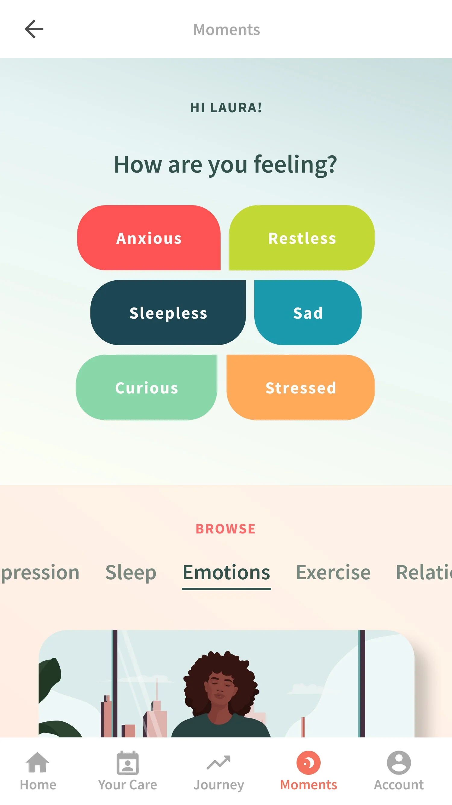
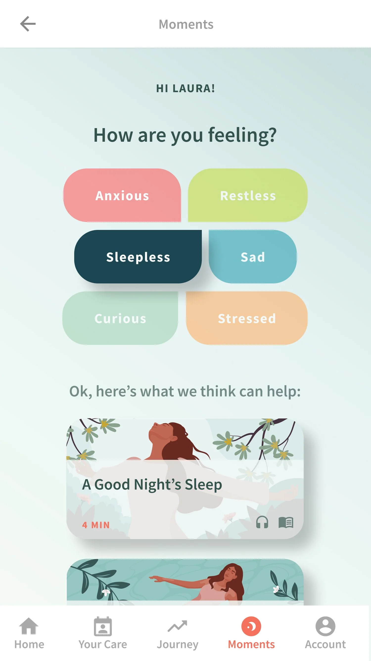
We leveraged the library's existing thematic organization and asked users how they were feeling in the moment. Their responses were mapped to existing categories, creating a guided path for the user, without major backend changes.
Solution
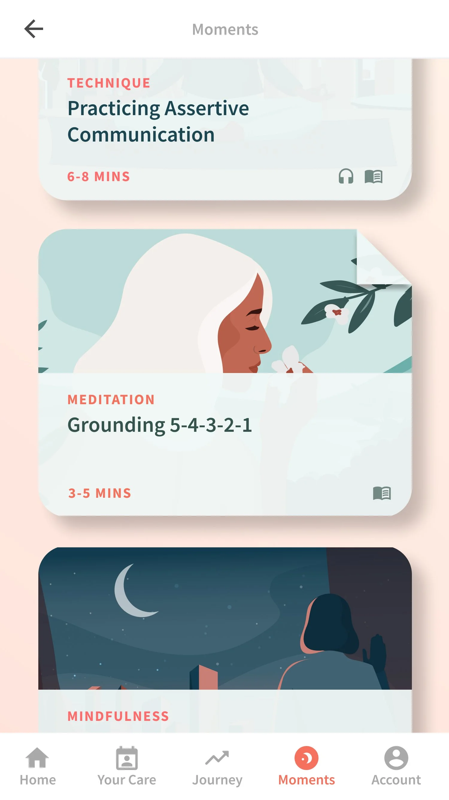
The navigation evolved into a blend of emotion-based menus and a comprehensive library.
The color scheme emphasizes calmness and clarity, while animations and affirmations reinforce accomplishment after each exercise.
Result
The feature significantly boosted the app's downloads (+136%,) and the exercises became a standout brand element, earning praise from users and HR leaders for being clear, peaceful, and supportive.
Facebook Web Checkout
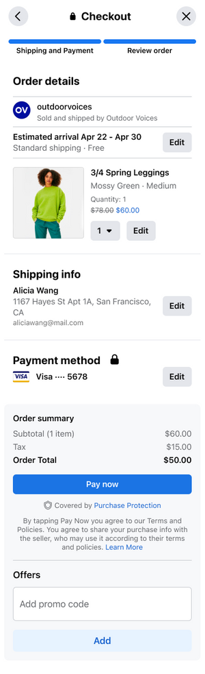
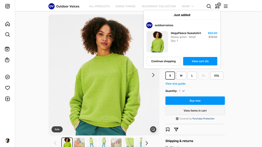
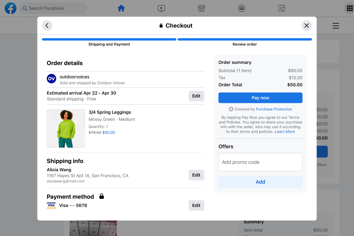
Checkout design lead on this cross-functional and cross surface project overhauling the entire Shops funnel.
Problem
An outdated experience, inconsistent with industry standards and the apps.
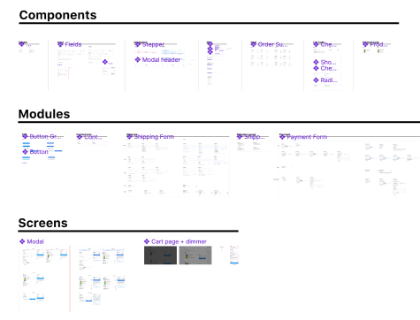
Disparate components across platforms.
Lagging conversion on a platform with higher average order value than mobile.
Approach
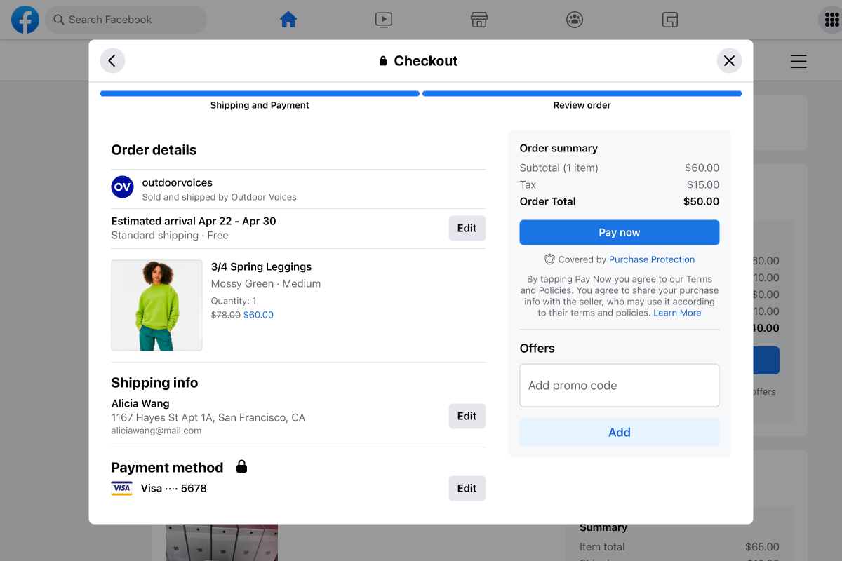
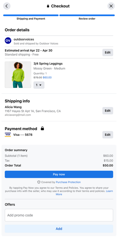
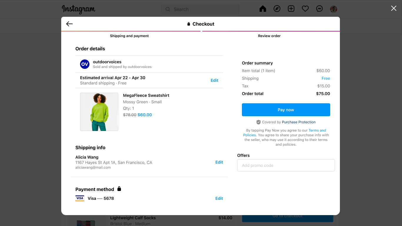
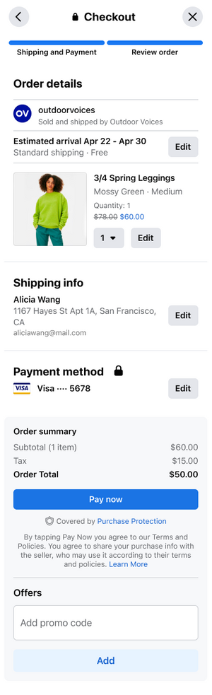
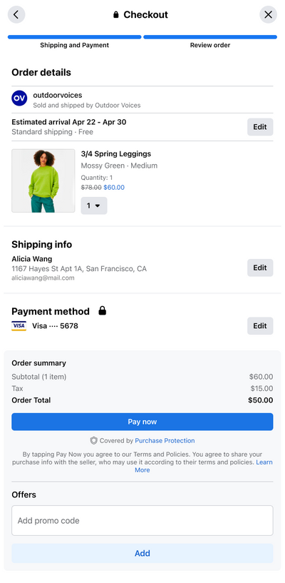
Complete UX redesign - aligned with mobile patterns, with thoughtful, web specific deviations.
Demographic data, funnel analysis, competitive benchmarks, and
Solution
UX improvements: e.g. a stepped flow, order total visible throughout, a fully responsive framework.
A unified web component library aligned with the Facebook Design System and apps.
Result
A significantly increasing transactions and gross merchandise value.
A streamlined design workflow, improved cross-org collaboration.
A scalable foundation for future Shops features (e.g. subscriptions, donations…)
Spring Health App
Problem
Spring Health needed to integrate a library of CBT and mindfulness exercises into its mobile app under tight constraints: text-heavy content, phased releases, minimal time for research, and no ability to tailor experiences to specific conditions.
Approach
We leveraged the library's existing thematic organization and asked users how they were feeling in the moment. Their responses were mapped to existing categories, creating a guided path for the user, without major backend changes.
Solution
The navigation evolved into a blend of emotion-based menus and a comprehensive library.
The color scheme emphasizes calmness and clarity, while animations and affirmations reinforce accomplishment after each exercise.
Result
The feature significantly boosted the app's downloads (+136%,) and the exercises became a standout brand element, earning praise from users and HR leaders for being clear, peaceful, and supportive.
One Kings Lane Checkout
Problem
After a major replatform, One Kings Lane’s new checkout funnel was underperforming. Drop-off rates were rising, and the redesigned experience was more cumbersome than before.
Returning customers, who should have had the easiest path to purchase, were forced through a 7-step process—far behind industry best practices. The business needed to improve completion rates while users needed a faster, more intuitive, and less frustrating way to check out.
Solution
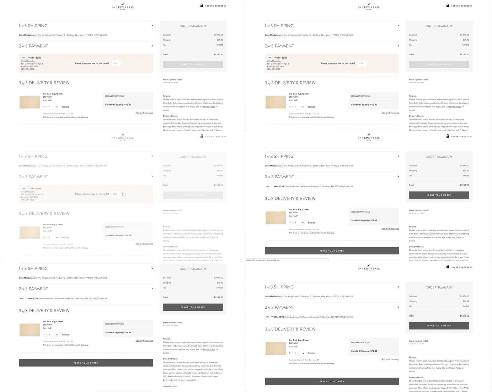
We started with quick wins, like surfacing delivery/returns info and auto-formatting payment fields, which reduced customer support calls and errors.
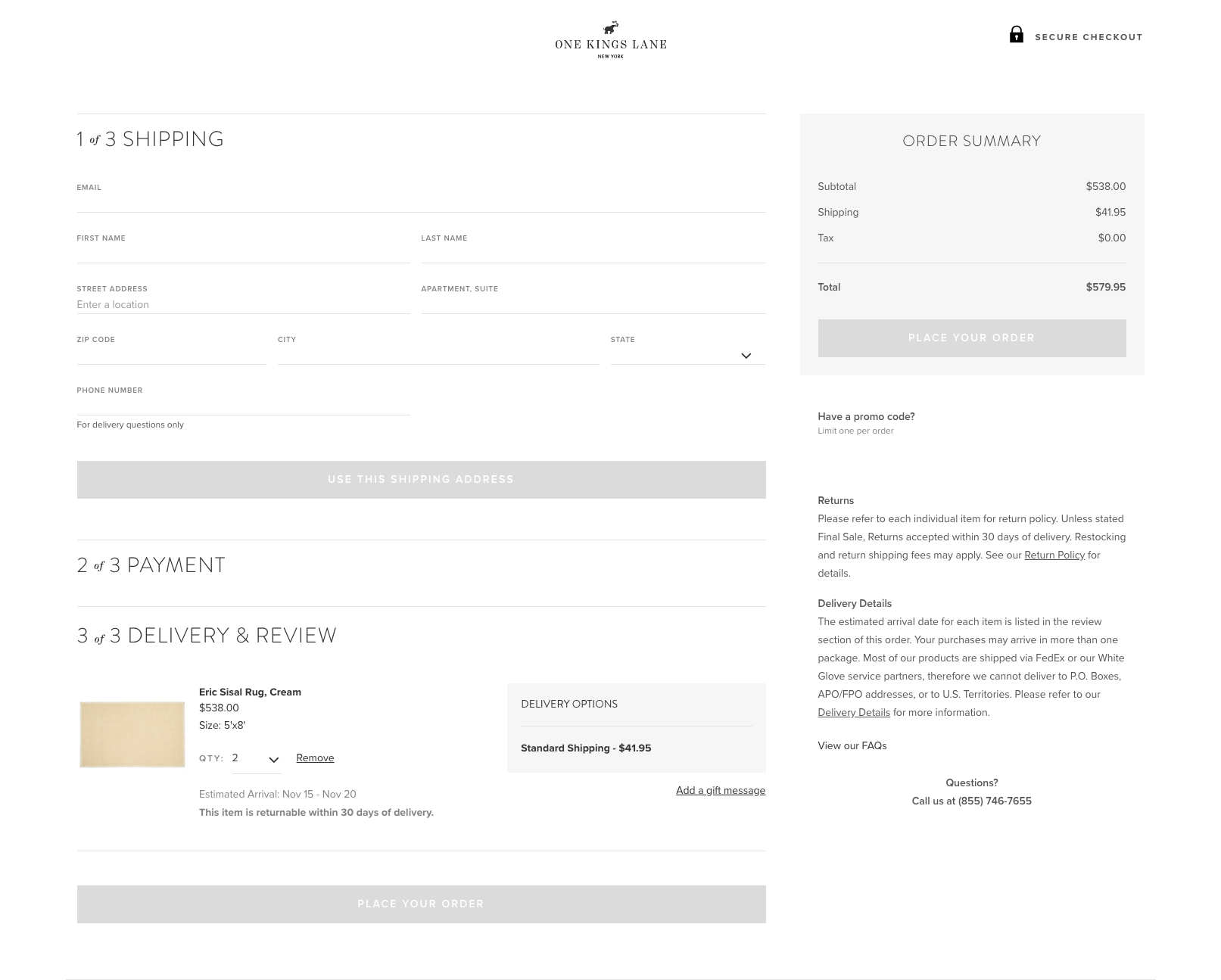
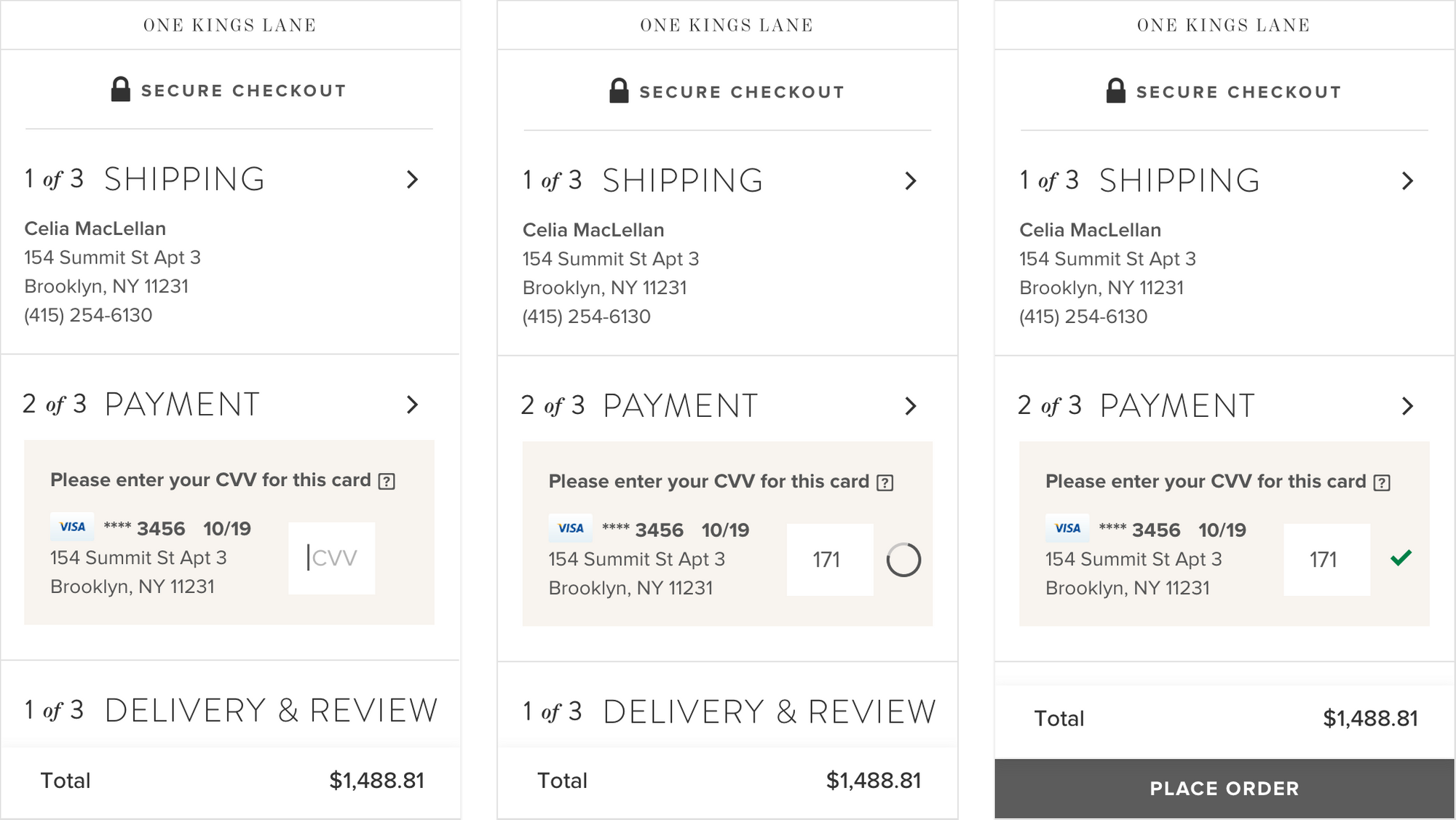
Through iterations, sketches, and usability testing, we developed a simplified, numbered step flow that collapsed completed sections and reduced form height. Key changes included merging shipping and review, removing the billing step, and defaulting to saved addresses and payment methods for returning users. This allowed frequent buyers to complete checkout in just one click by entering only their CVV.
Approach
As part of the newly formed Product Design team, I owned the back of the customer funnel (Cart, Checkout, Order Management). I partnered closely with engineering, product, and research to identify pain points using usability data, heatmaps, session recordings, and customer service feedback.
Competitive analysis revealed that successful checkouts streamlined steps to 3–4, with one-click flows for returning users. We set hypotheses to reduce cognitive load, align with industry norms, and minimize friction by collapsing or removing unnecessary steps.
Results
The redesign delivered a smoother, more intuitive experience for all users and a dramatically faster flow for returning customers. Completion rates improved by 10%, customer support calls decreased, and the new funnel aligned One Kings Lane with industry best practice.